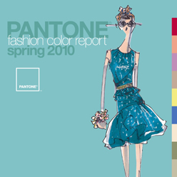
 Pantone is out with their Spring 2010 color forcast. This is a big file, a lot bigger than the previous fashion forcast reports, by several pages.
I love to browse the pages to see what the designers come up with.
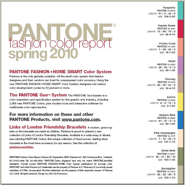
Turquoise appears to be the big story. We’ll see turquoise in quite a lot of items this Spring. That is always a goofy color for some people and I know it’s not always my first or best choice.
Like the previous reports, print out the colors page, put it into your purse and reference it when you are out shopping for material. Or better yet, shop your stash and come up with your own SWAP for Spring.
Here is the link
or the file Pantone-FCR-sp2010f
and below is the color page.


Enjoyed the Pantone site and most of the designs were appealing, but I have a problem with the drawing. Not the garment, but the model. Why the funkyness? Where are my pleasant looking people? Maybe I just need to accept that my world is gone and it’s a new era, but I have a problem with displaying the garment on a stick. Can’t relate to that.
LikeLike